Capabilities
Experience Weevar's usage and functions.
Activation#
When Weevar is installed, its default state is a single floating trigger button mounted as an overlay in the top-right corner of your viewport.
To activate:
- Press ⌘⇧E (Mac) or Ctrl+Shift+E (Windows/Linux), or
- Click the floating trigger button.
The keybind is suppressed when you're typing in an <input>, <textarea>, or contenteditable element, so it won't fight your forms.
You can drag the trigger button to reposition it anywhere on screen. Its location is preserved across reloads.

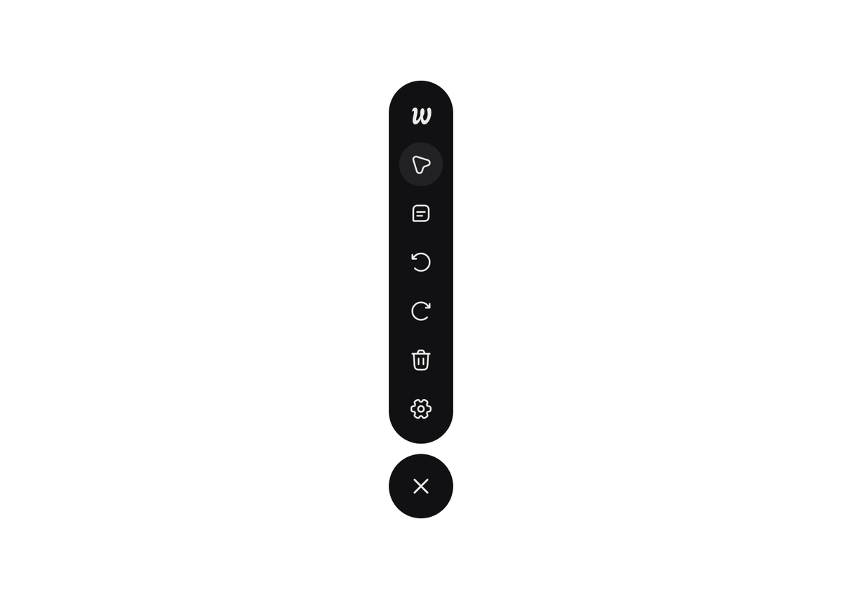
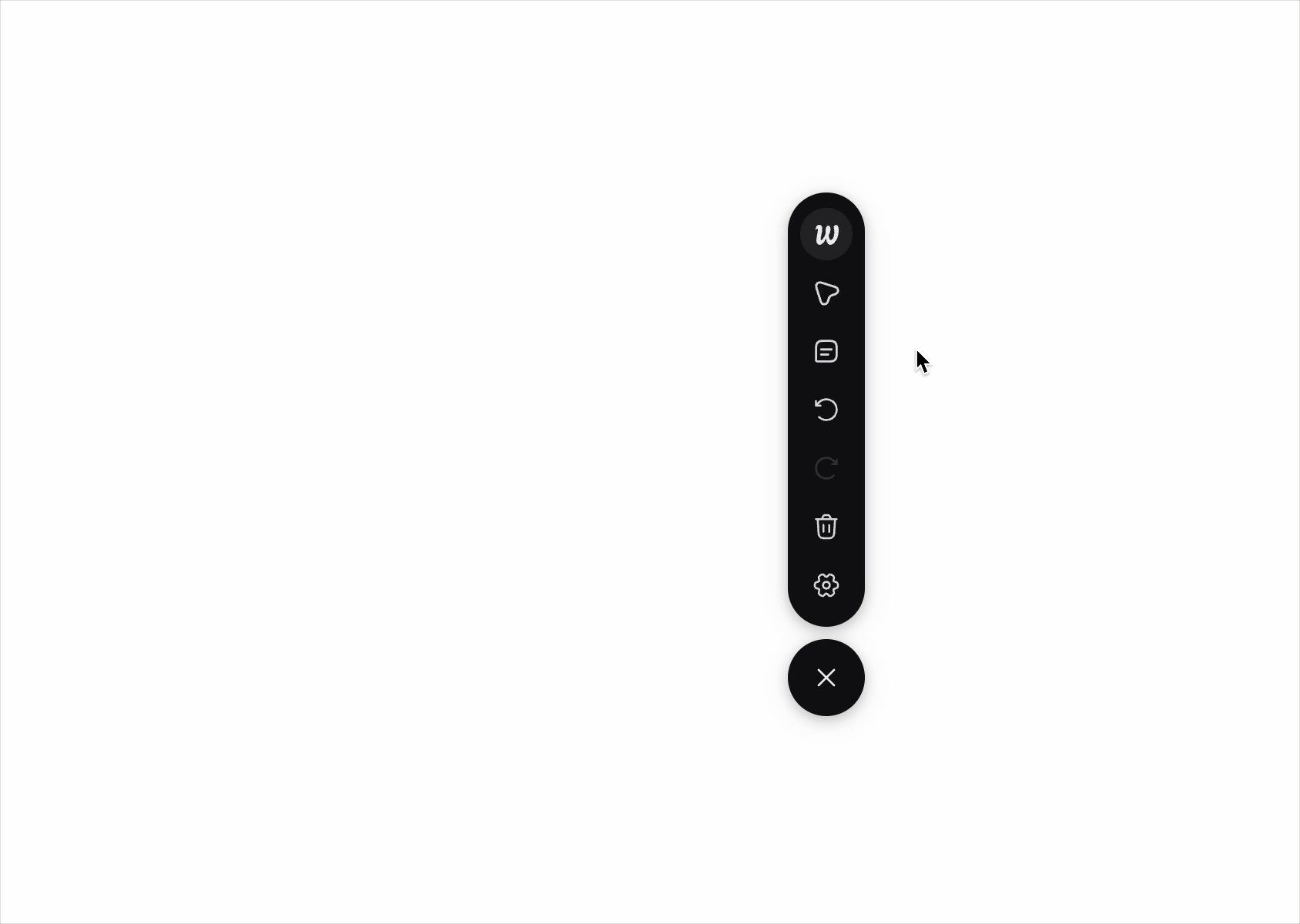
Tool dock#
Once activated, a vertical dock appears with the following controls:
- Overview (O): open the session summary tray
- Weevar Pointer (W): with the pointer selected, you can hover, select, drag, and style elements
- Prompt (P): generate or refresh the prompt for the current session
- Undo (U): revert the last change (layout move or style tweak)
- Redo (R): re-apply a reverted change
- Delete (D): clear all session changes and selection
- Settings: open the settings tray (target tool, prompt style)
- Close (Esc): collapse the overlay
The dock can be moved around. Its position persists across reloads.
Each tool button shows a tooltip with its keyboard shortcut.
#
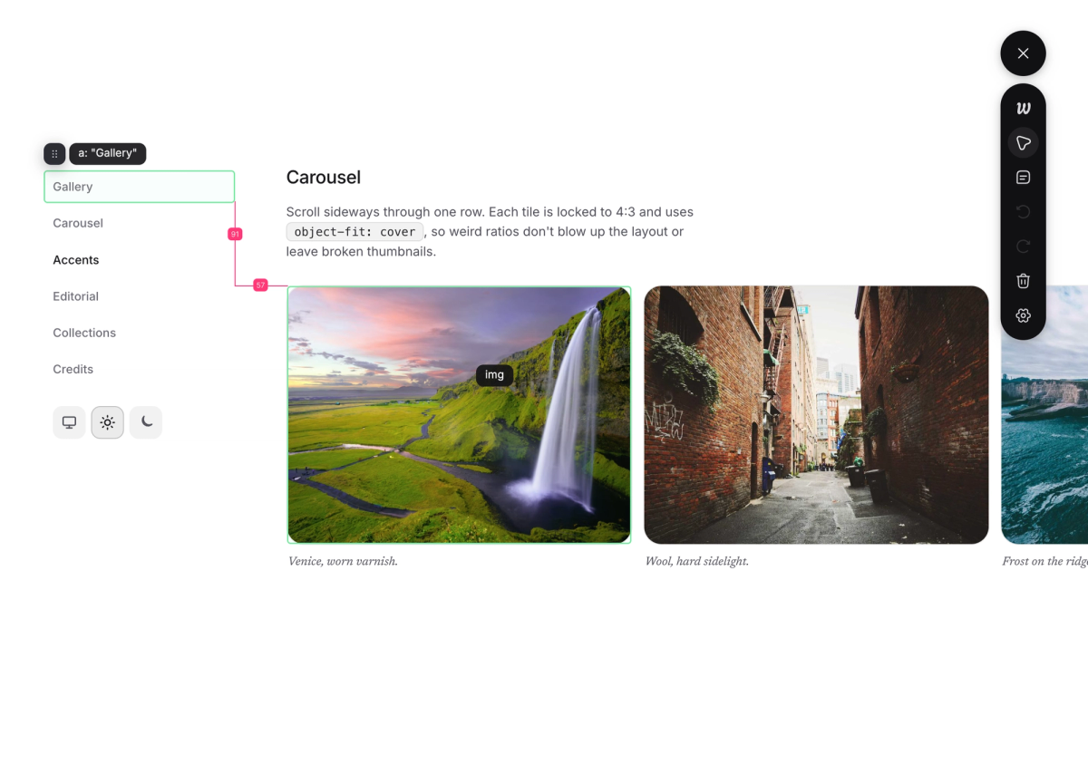
Hover and select#
While the overlay is active, click the pointer button or press W to use the pointer tool, then hover over any element on the page. You'll see:
- A selector highlight around the element's bounding box
- A small label tag in the corner showing its identity
Click to select. The Edit Tray opens immediately, showing editable style controls for that element. The element is also ready to drag.
Drag and drop#
Drag any selected element to:
- A new position among its siblings (reorder), or
- Inside a different container entirely (move).
While dragging:
- The original element ghosts at reduced opacity in place, so you can see where it came from
- A small preview follows the cursor
- Valid drop containers gain a dashed outline
- An insertion bar appears between siblings to show exactly where the element will land
- For flex containers, the layout reflows in real time using CSS
order(no DOM mutation during the drag, see Stable element identity) - The page auto-scrolls when you drag towards the edges to a destination not in view
Release to drop. Press Esc at any moment to cancel.
#
Style editing#
When you select an element, the Edit Tray opens by the side of the tool dock. You can see and modify the element's visual properties in real time, directly in your running app, without touching a stylesheet or writing any code.
Every change you make in the tray previews instantly on the element in the page. When you're satisfied, those changes are recorded as structured style edits in the session, alongside any layout moves you've made. Everything feeds into the same prompt.
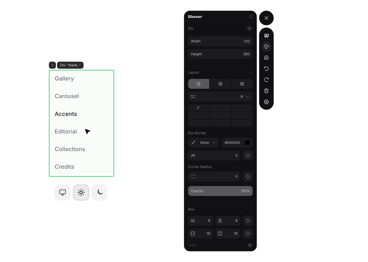
What the Edit Tray shows you#
The controls that appear in the Edit Tray depend on what kind of element you've selected. Weevar classifies each element automatically into one of five categories: text, image, SVG, stack, or generic, and shows you the controls that are relevant for that type.
#
#
The tray adapts:
- Text elements: font size, font weight, font family, line height, letter spacing, text alignment, and font colour, everything you'd reach for when adjusting a heading or paragraph.
- Stack elements (flex and grid containers): layout type (block, flex, or grid), flex direction, gap, grid columns, and main and cross axis alignment (
justify-content,align-items). These controls let you adjust how the container distributes its children without manually editing CSS. - Image elements:
object-fitmode alongside the standard width and height controls. - SVG elements: width, height, fill colour, and stroke colour.
- Generic elements: foreground colour, background colour, display mode, width, and height.
Regardless of element type, you'll always have access to the box model controls: width and height, padding, margin, border (including border weights, border style, and border colour), corner radius, and opacity. These are the controls that almost every element needs, so they're always present.
Raw CSS panel: the Edit tray has an expandable Raw CSS panel that can be expanded above the primary controls. It shows all the underlying CSS property names and their computed values.
Spacing measure#
Hold Alt while an element is selected, then hover another element anywhere on the page. Weevar draws measurement lines between the two elements, showing the horizontal and vertical distance between their edges. This is useful when you're trying to decide how much padding to add or how far to shift something. You can measure the gap first, then adjust the controls.
#
Trays#
Weevar uses four slide-in trays, anchored to the side of the dock. Only one tray is visible at a time. Each tray has a hide affordance in its header to dismiss it without losing state.
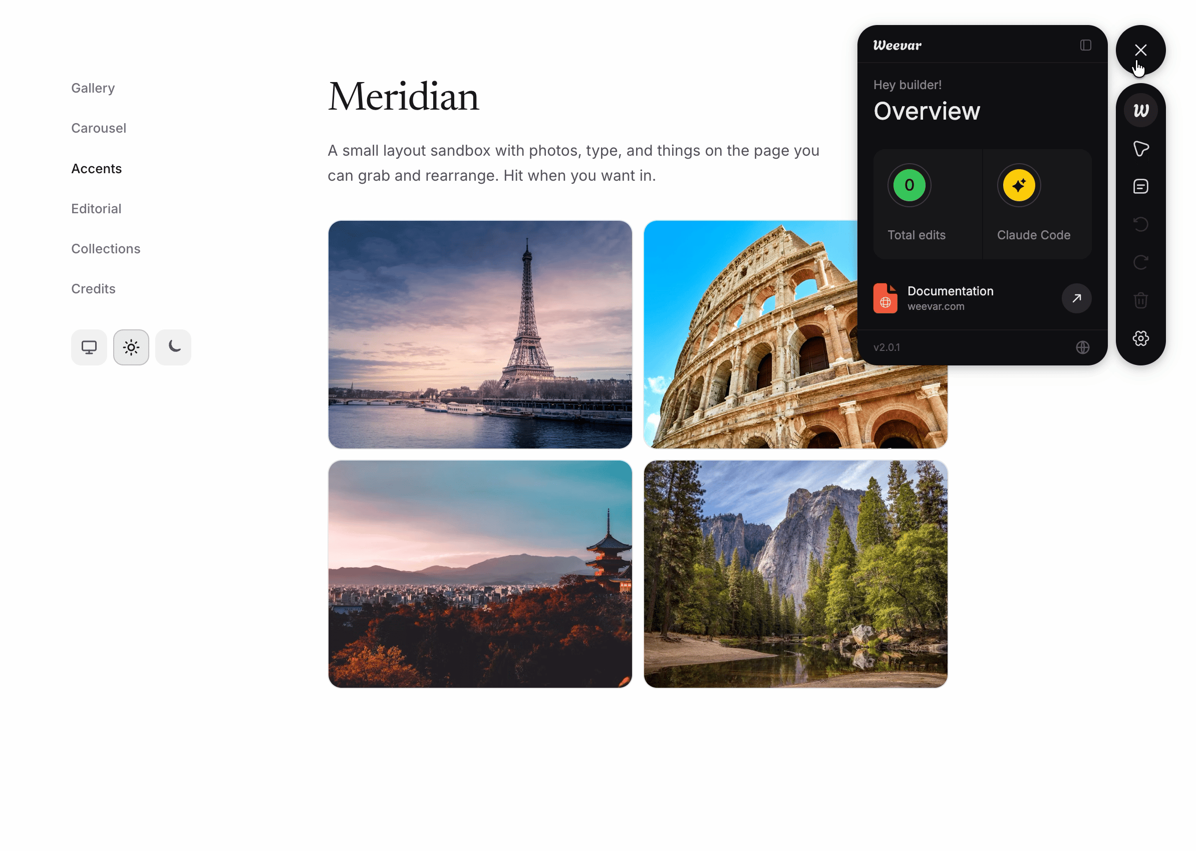
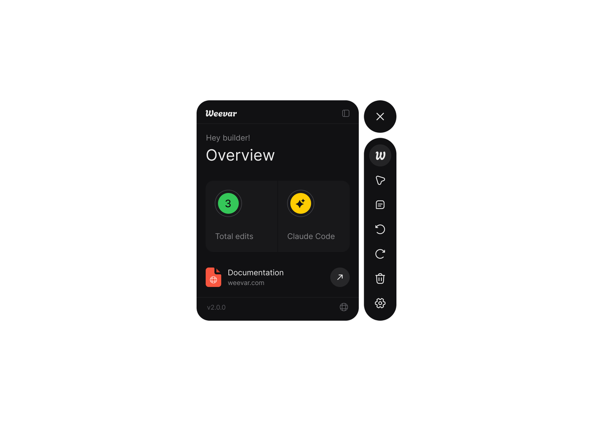
Overview tray#
A live summary of the current session. Shows the total number of edits made, combining layout moves and style tweaks into one count, and your currently selected target AI coding tool. Useful when you've made several changes across different elements and want to verify the scope of the session before generating the prompt.
There's a "documentation" arrow in the Overview tray that opens this website in a new tab.
#
Edit tray#
The edit tray appears when you select an element with the pointer tool. It contains all the style controls described above. Dismissing it doesn't deselect the element; you can reopen it by selecting the element again.
#
Prompt tray#
The output of the session. Shows:
- The generated prompt, Short or Detailed depending on your Settings, covers all layout changes and style tweaks in the session
- A Copy button
#
Settings tray#
- Target Tool: Here you can select the AI tool you use: Claude Code, Codex, or Generic. This tailors your prompt to fit your AI workflow
- Prompt Style: Choose the level of information included in your prompt between Short or Detailed.
#

Undo, redo, delete#
Every edit is recorded in a session.
- Undo (U) reverts the most recent edit and updates the prompt context.
- Redo (R) re-applies the previous un-done edit.
- Delete (D) wipes all session edits and resets the view to the original state.
Repeated edits of the same element collapse into a single effective change in the prompt. If you edit the same card three times, the prompt only stores the original position of the card and the new (final) position, not the full journey of one element.
Refreshing the page clears the session. Weevar never persists state to disk.
Keyboard shortcuts#
| Shortcut | Action |
|---|---|
⌘⇧E / Ctrl+Shift+E | Toggle the overlay |
Esc | Close overlay (doesn't delete edits made) |
W | Activate the Pointer tool |
O | Open the Overview tray |
P | Open the Prompt tray |
U | Undo the last change |
R | Redo the last change |
D | Delete all session changes and clear selection |
Alt + hover | Show spacing measurements between selected and hovered element |
Single-letter shortcuts are suppressed when you're typing in an input, textarea, or contenteditable element, and when modifier keys are held (so they don't collide with browser/OS shortcuts).
Source location#
When the bundler plugin is installed (Vite, SWC, or Webpack), Weevar injects a data-wv-source="<file>:<line>:<col>" attribute onto every JSX element at build time. The runtime reads this and includes it in prompts for both layout changes and style tweaks.
Without the plugin, prompts fall back to DOM identity (tag names, selectors, and class names). Still useful, less precise. The Prompt tray will show a hint if source location is missing.
See Vite plugin → and SWC plugin →.
Tailwind awareness#
If your project has a tailwind.config.{js,ts} or the tailwindcss package installed, Weevar's Vite plugin auto-detects it and switches on tailwindVerbatimClasses in the prompt config. With this on, prompts include the parent's actual utility classes verbatim instead of paraphrasing the layout in English.
For style tweaks, Tailwind awareness adds a Tailwind utility suggestions block to Detailed prompts, listing the utility classes that most closely match the style changes you made. The agent can use these as a starting point instead of writing raw CSS.
Example prompt fragment with Tailwind awareness (layout):
Container: <nav className="flex gap-6 items-center">
Without it:
Container: <nav> (flex-row layout)
The verbatim classes are easier for an AI to grep against your source code.
Stable element identity#
Weevar identifies elements with a four-layer scheme so that selection survives React re-renders and HMR:
- React Fiber path: most stable when available
- Source location: set by the bundler plugin
- DOM path:
nth-childsegments from the document root - Content hash: text-content fingerprint, used for tie-breaking
If the element re-renders during a drag or a style edit, Weevar tries each layer in turn to relocate it. If all four fail, selection is silently cleared.
Implementation detail: Weevar reads React's internal __reactFiber$… key from selected DOM nodes. This is stable across React 17, 18, and 19.
Limitations#
- React only. Vue and Svelte adapters are planned for a future release.
- Chromium-first. Firefox and Safari are best-effort, not parity-tested.
- Cross-origin iframes are opaque. Same-origin iframes will be supported in a future release.
- Custom elements with closed shadow DOM are treated as a single opaque node, you can't select or style inside their internals.
position: fixedandposition: stickyelements can be selected and edited, but flow-based reordering won't always produce the visual you expect.- Production runtime is intentionally a no-op. Don't try to ship it; you can't.